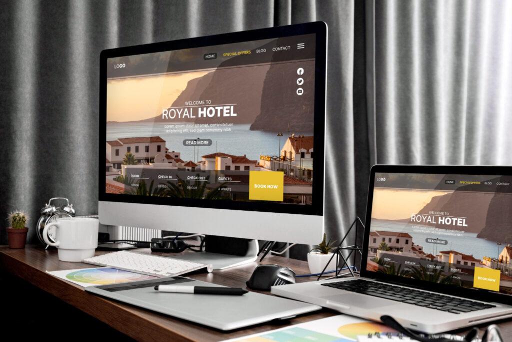
One can make attractive CTAs that grab users’ attention and nudge them to act by combining clear, succinct content with appealing design, smart placement, persuasion, and mobile-friendly design.
On websites and landing pages, call-to-action buttons are essential for promoting conversions and attaining desired results. Businesses may develop compelling CTAs that push users to perform particular actions by applying effective design methods, which will ultimately boost conversion rates and lead to commercial success.
I. The Importance of Call-to-Action Buttons
A. Defining Call-to-Action (CTA):
A call-to-action is a button, link, or visual element that prompts users to take a specific action, such as signing up for a newsletter, making a purchase, or downloading a resource.
B. The Role of CTAs in Conversions:
CTAs are essential for directing users towards desired activities, boosting conversion rates, and accomplishing organisational objectives.
II. Elements of an Effective Call-to-Action Button
A. Clear and Concise Text:
Use wording that is appealing and straightforward to communicate the action that consumers should do. To promote simple comprehension and prevent ambiguity, keep it brief.
B. Eye-Catching Design:
Select buttons with eye-catching designs that stand out from the rest of the webpage. To bring emphasis to the button, use contrasting hues, a suitable size, and attention-grabbing forms.
C. Placement and Visibility:
Place the call-to-action button in a natural attention-grabbing location, like above the fold or at the end of the pertinent material, to capture readers’ attention. Make sure the button is distinguishable from the surrounding objects and is easy to see.
D. Use of Persuasive Language:
Make use of persuading language to motivate users to act. Make your points with action verbs and strong language that conveys a sense of worth or urgency.
E. Mobile-Friendly Design:
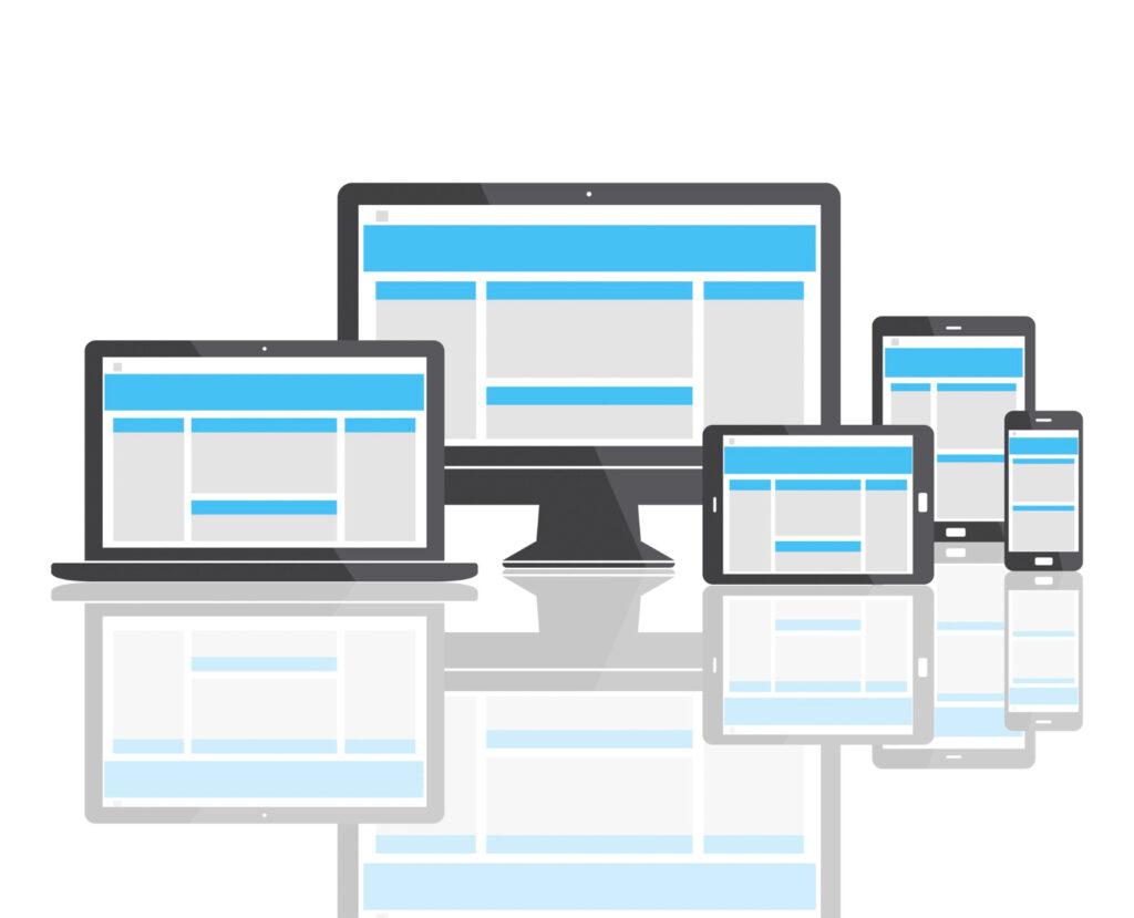
To provide a seamless user experience, call-to-action buttons should be optimised for mobile devices. Make buttons big enough to tap easily, and take into account responsive design guidelines for various screen widths.
III. Best Practices for Designing Engaging CTAs
A. Experiment with Colours:
Select colours that are eye-catching and arouse feelings consistent with the behaviour you want users to exhibit. To make your CTA button stand out, take into account contrast and colour psychology.
B. Implement Whitespace:
To improve its visibility and make it simpler for users to concentrate on the button itself, surround your call-to-action button with a lot of whitespace.
C. Incorporate Visual Cues:
Use visual signals to draw users’ attention to the call-to-action button, such as arrows, icons, or images. These cues can aid with eye navigation and highlight the intended action.
D. A/B Testing:
To compare several variations of your call-to-action buttons, run A/B testing. Test several layouts, words, colours, and positions to find the one that will increase conversions the best.
E. Clear and Compelling Copy:
Create convincing and actionable copy that expresses the value or advantage users will receive by acting in the intended way. Use clear, persuasive language to force people to take action.
F. Size and Shape:
Make sure your call-to-action button is big enough to click quickly and sticks out from the rest of the page’s features. Try out various shapes, such as circles, rounded rectangles, or rectangles with rounded corners, to determine which one best complements your design and grabs attention.
IV. Accessibility Considerations for Call-to-Action Buttons
A. Colour Contrast:
Make sure there is enough contrast between the colour of the button and the background so that users with visual impairments can utilise it.
B. Alt Text for Images:
For screen reader users, if your call-to-action button has a picture, make sure to include alt text that explains what the button does.
C. Keyboard Accessibility:
Make sure users can use the keyboard in addition to the mouse to navigate and click the call-to-action button.
V. Tracking and Analysis of CTA Performance
A. Set Conversion Goals:
Establish precise objectives and criteria to monitor the effectiveness of your call-to-action buttons. This could involve click-through rates, conversion rates, or the volume of activities that were really taken.
B. Use Analytics Tools:
Utilise analytics programmes like Google Analytics to track the effectiveness of your call-to-action buttons. Make decisions based on data by frequently analysing data to find areas for improvement.
Designing engaging call-to-action buttons is crucial for driving conversions and achieving business goals. Remember to follow best practices, conduct A/B testing, consider accessibility, and track performance to continuously optimize your call-to-action buttons and improve conversions on your website or landing pages.


