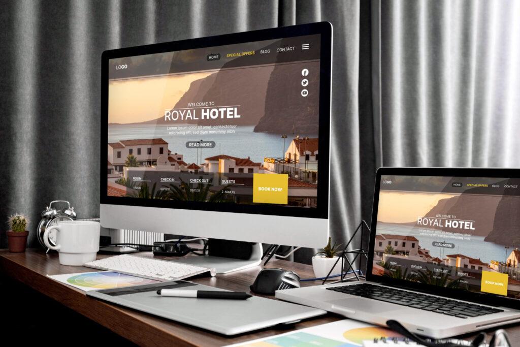
White space serves to enhance readability, direct attention, and create visual breathing room, which all contribute to a better user experience and highlight important components.
White space, also known as negative space, refers to the empty or blank areas between elements on a webpage. While it may seem counterintuitive, incorporating white space in web design is a powerful technique that enhances clarity, focus, and visual appeal.
I. The Power of White Space
A. Creating Visual Breathing Room:
By creating a visual gap between pieces, white space makes it easier for visitors to traverse the material. It keeps things from being crowded and cluttered, giving the website a sense of harmony and balance.
B. Enhancing Readability and Comprehension:
Ample white space surrounding text blocks makes the information more readable, which enhances readability. It eases eye strain, enhances comprehension, and enables users to concentrate on the crucial details.
C. Directing Attention and Focus:
White space that is thoughtfully positioned on a webpage can direct readers’ attention to important components or call-to-action buttons. White space helps to provide a clear visual hierarchy, boost user engagement, and separate and highlight key pieces.
II. Types of White Space
A. Macro White Space:
The term “macro white space” describes the substantial empty spaces found in margins, gutters, and padding on websites. It gives the content a framework and gives the room to breathe. Macro white space streamlines the design and creates visual divisions.
B. Micro White Space:
The smaller spaces or intervals between individual items, such as sentences, photos, buttons, or icons, are referred to as micro white space. It creates breathing space around these components to avoid visual clutter and let each one shine out on its own.
III. Best Practices for Incorporating White Space
A. Embrace Minimalism in Design:
By eliminating superfluous parts and concentrating on the crucial content, simplify your design. You can increase the amount of white space and make the remaining items stand out by removing visual clutter.
B. Use Sufficient Margins and Padding:
Make sure there is sufficient space between content blocks and around the edges of your webpage. A buffer zone created by ample margins and padding prevents items from feeling crammed together.
C. Balance Content and White Space:
Strive for a harmonic ratio of content to white space. A webpage shouldn’t be overloaded with information. Give each component ample breathing room so that users may easily process the information.
D. Create Consistent Spacing:
Keep your design’s spacing even throughout. Consistency improves the design’s predictability and user-friendliness while also establishing a visual rhythm.
E. Pay Attention to Line Height and Letter Spacing:
Your text’s line height and letter spacing should be adjusted to make it easier to read. The legibility and appearance of the text can be significantly improved by slightly raising line height and letter spacing.
F. Experiment with Layouts:
Examine various design configurations that make good use of white space. To add aesthetic interest and balance, think about employing asymmetric or asymmetric grids.
IV. Examples of Effective White Space Usage
A. Apple:
The website of Apple is a perfect illustration of how to use lots of white space to produce a simple yet sophisticated design. The large amount of empty space surrounding each element aids in drawing attention to the essential words and product images.
B. Google:
The effectiveness of simplicity and white space is demonstrated by the Google homepage. The page’s search bar, which is its main focus, is brought to the user’s attention by the page’s minimalistic style and abundance of white space.
By embracing the power of white space, designers can create visually appealing and functional websites that engage users and convey information effectively. Remember to strike a balance between content and white space, maintain consistency, and experiment with different layouts. With careful attention to white space, you can elevate your web design and deliver an exceptional user experience.


